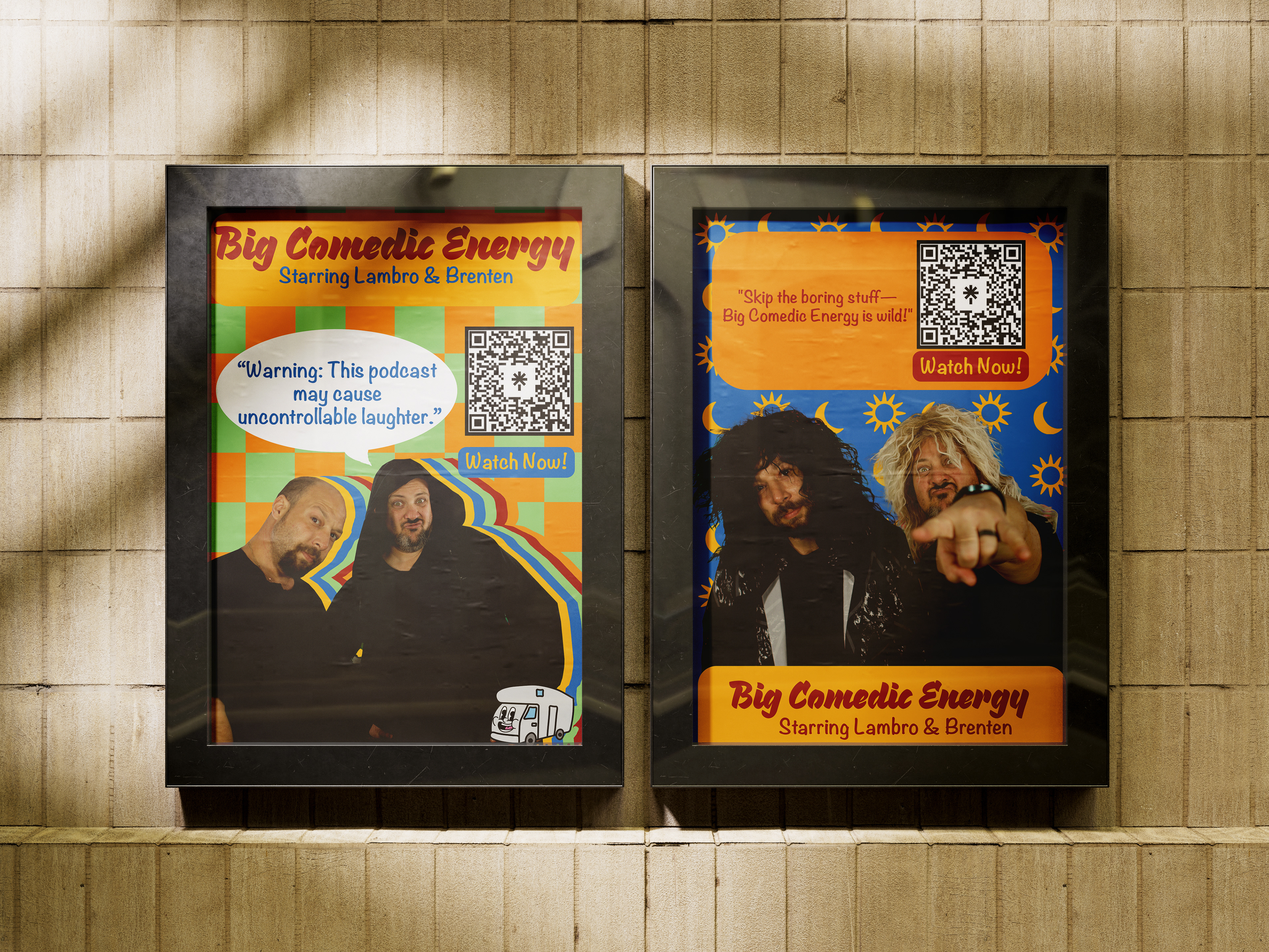
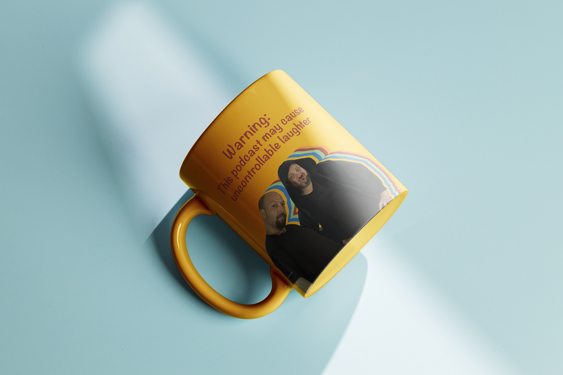
For this project, my client requested a logo, two marketing posters, podcast segment popups, and a custom handwritten font. The goal was to create a cohesive visual identity that reflected the unique personality of the brand, appealing to podcast listeners.
I worked closely with the client to ensure the designs captured their vision, incorporating quirky typography, vibrant colours, and a playful aesthetic.
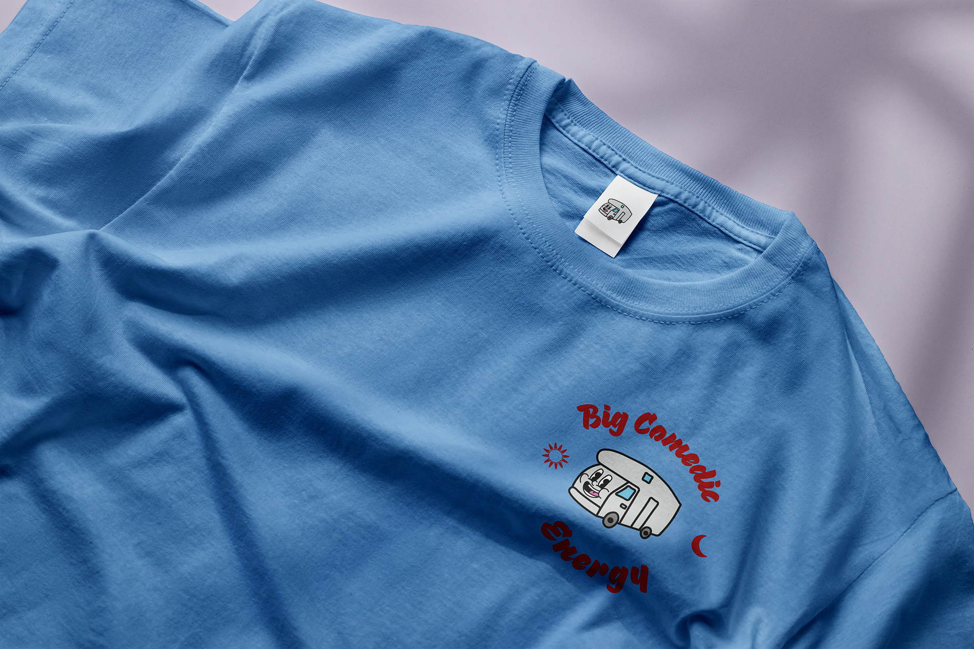
Big Comedic Energy draws inspiration from vintage themes and the lively fanfare aesthetic, setting a humorous tone even before listeners tune into the podcast. The mascot featured in the logo was chosen to represent the podcast's filming location, adding a playful and meaningful twist to the design.
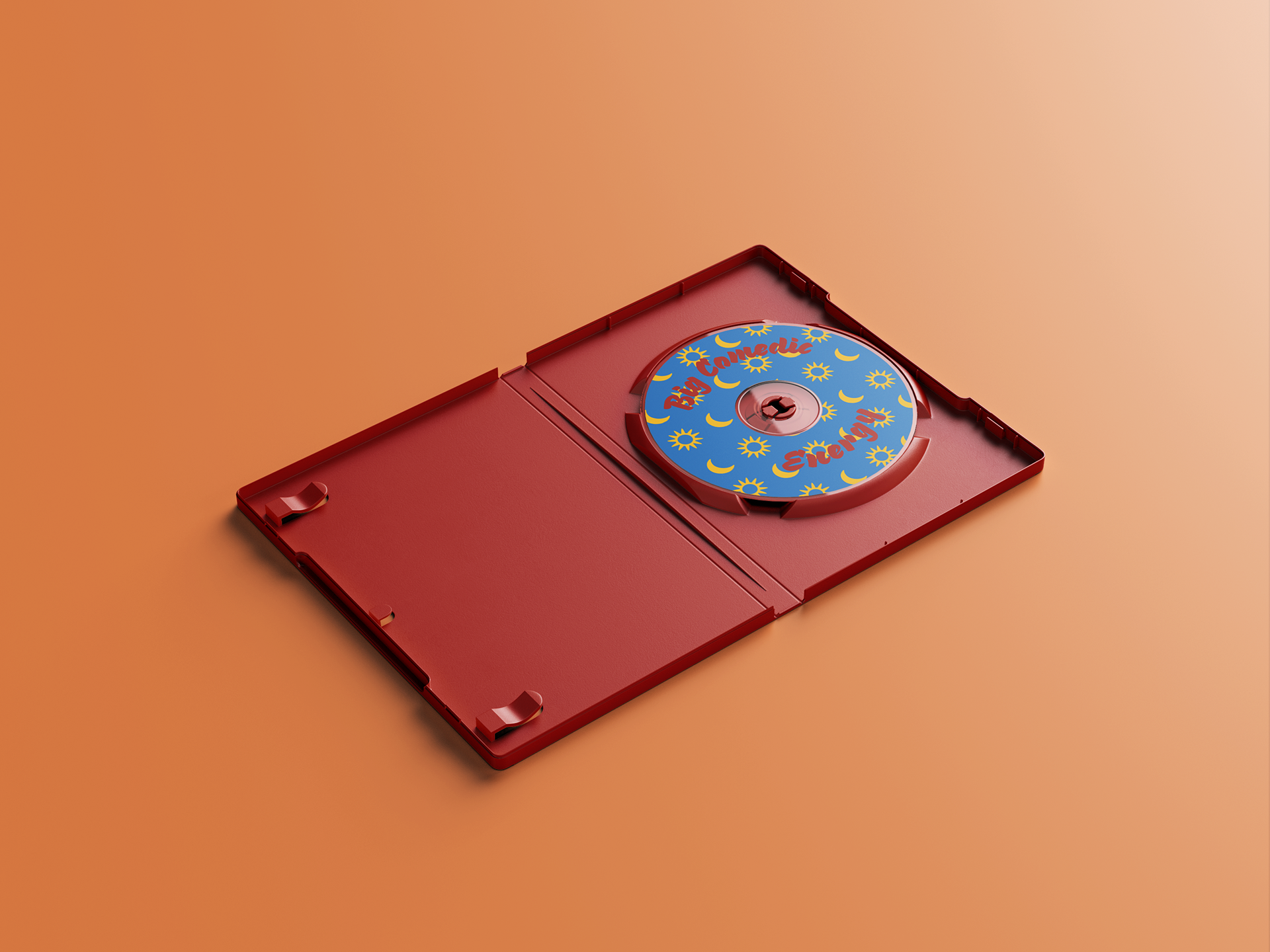
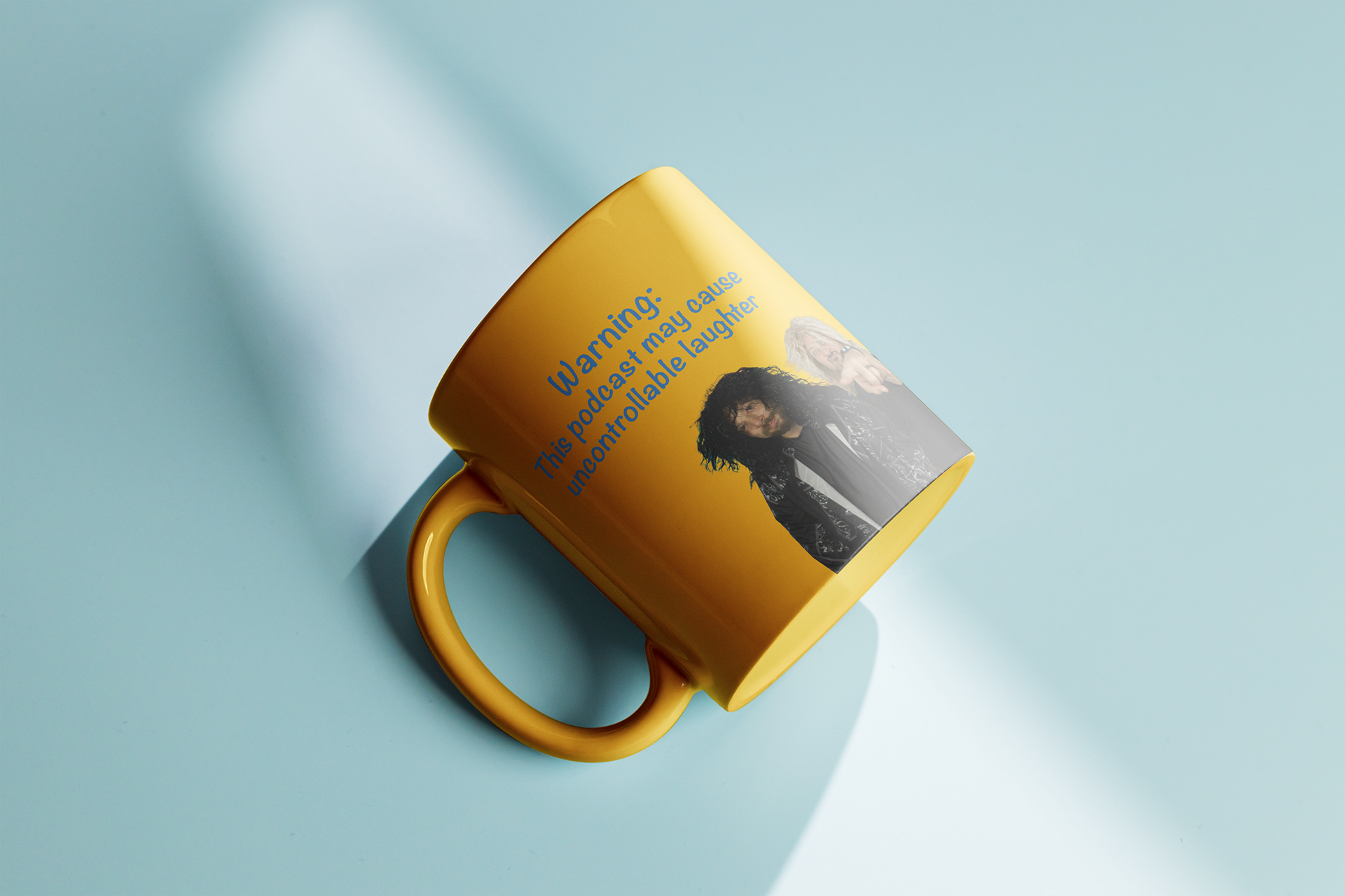
The style guide reflects this dynamic energy through a bold color palette, quirky yet retro-inspired typography, and fun graphical elements.
These choices create a cohesive visual identity that captures the brand’s personality while maintaining versatility for use across digital and print platforms. The aesthetic invites engagement, promising an entertaining experience that aligns with the podcast's comedic essence.


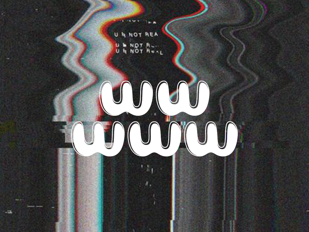
Segment pop-up

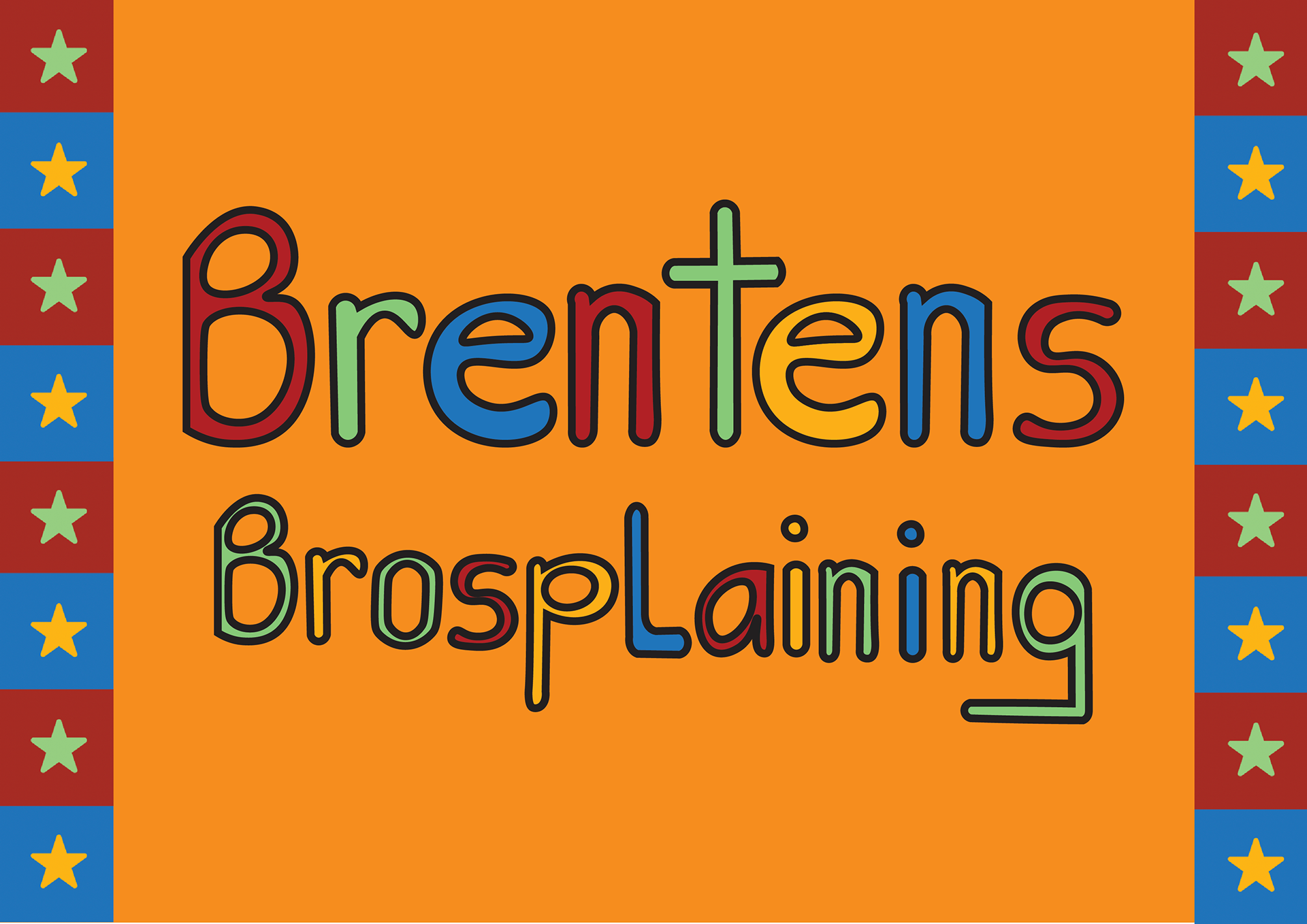
Handwritten font